

Hosted by The Broke and the Bookish
This was the hardest post to make. Everyone one knows and ignores the "Don't judge a book by its cover" rule. Sometimes, we can put our distaste aside and we're able to find our next favorite book. Sometimes a cover can be the prettiest thing you've ever seen, and yet the book makes you want to drive off a cliff. So I mean no offense or compliments to the stories beneath the following covers--my message is directed solely at the people who designed them.
Five Trends I Hate
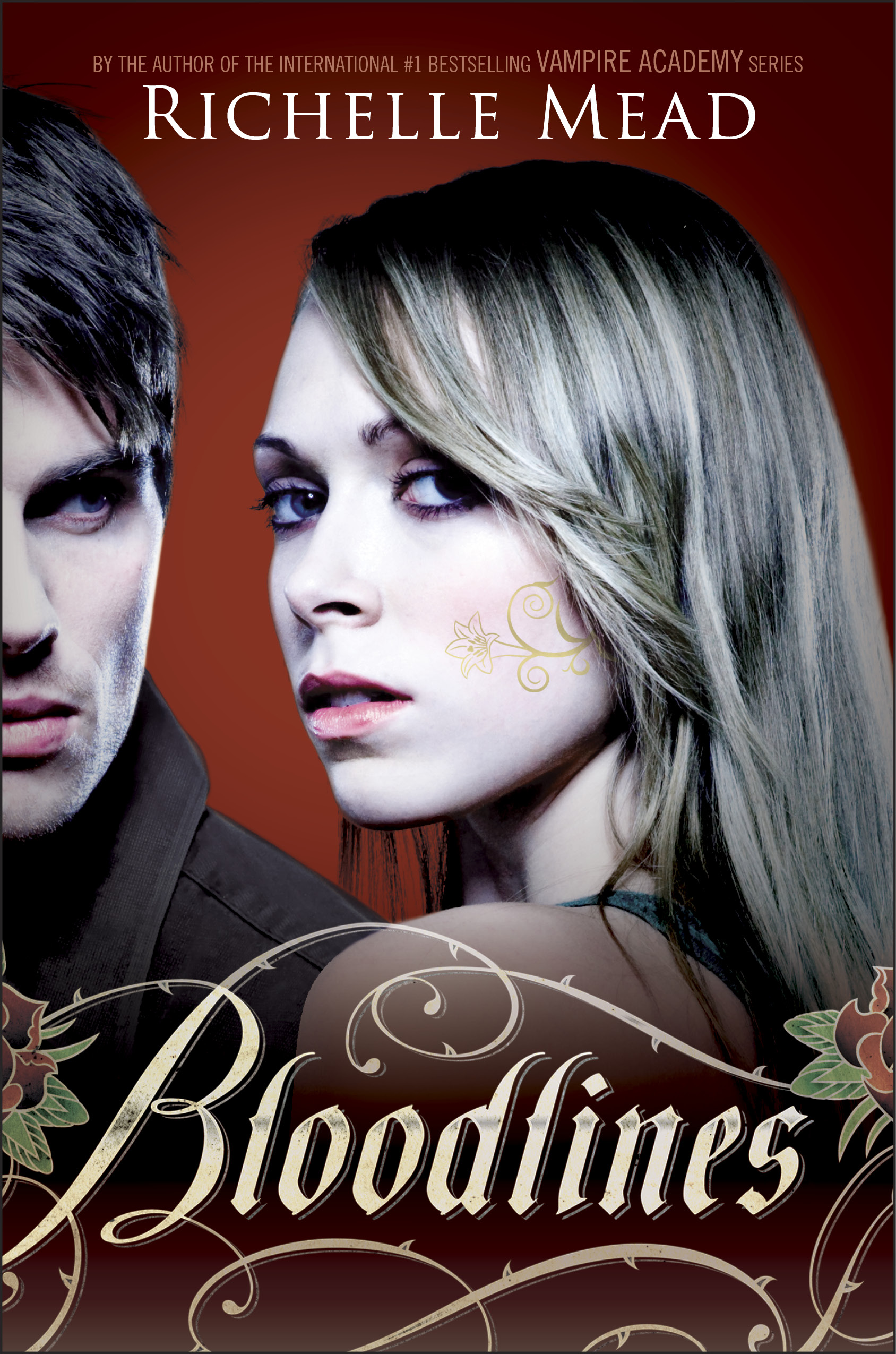
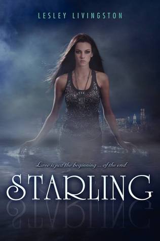
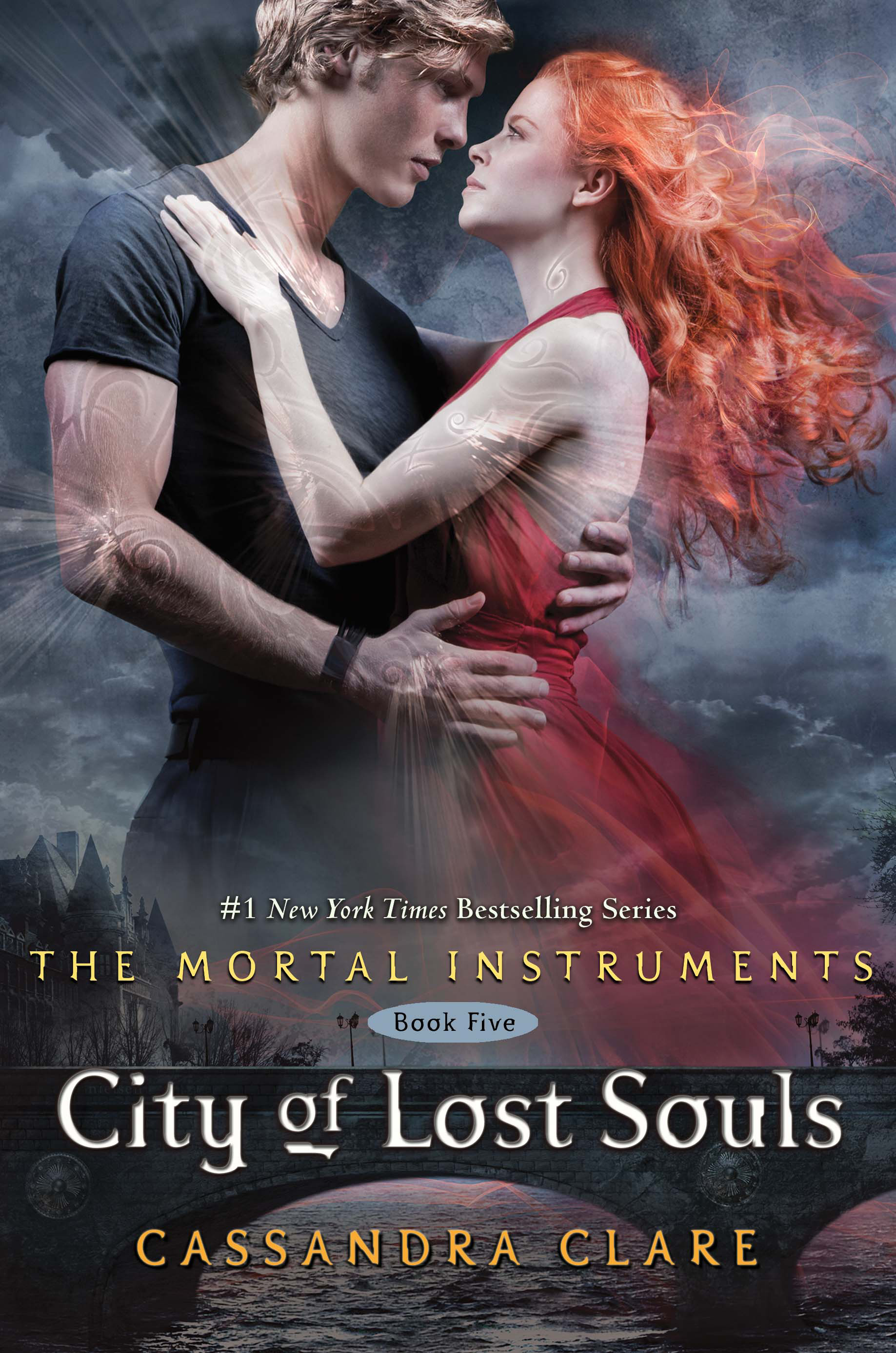
1. Faces. I cannot stand seeing faces on books that I'm reading. So much so that I'll take the jacket off if it's a hardcover, and I'll make a book cover out of paper if it's a paperback. Ugh.


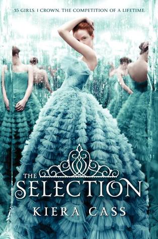
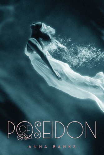
2. Dresses. I love pretty dresses as much as any other girl. Actually, I probably love dresses more than any other girl. I'm a little obsessed with pretty dresses. But these dresses on these sad looking supermodels have no business on my kickass YA books. It just makes the book feel significantly more pathetic and fragile.


3. Scratchy-ness. I'm not entirely sure why I don't like this style, but it's a really big turn off as a reader.


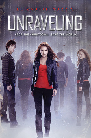
4. The CW. It may be strange, but I don't like it when teen books are advertised as if they're teen shows. There are no actors--just characters IN THE BOOK--so who the hell are these people on the cover? And why do they look like they're about to eat me a la Vampire Diaries?


5. Get a Room. I don't like PDA. I don't like it with that couple sitting next to me on the bus, I don't like it with the book I'm trying to read to escape that couple sitting next to me on the bus.


Five Trends I Love
1. Painted. Why don't we have more book covers that look like they were illustrated the good, old fashioned way? I mean, just look at those brushstrokes.


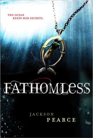
2. The symbolic item. I love it when books feature an object on the cover, inspiring all sorts of mystery around the theme and mood of the story.


3. Minimalistic design. What can I say? I love swirly things.
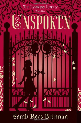


4. Simple. One delicately placed image does wonders for conveying an immediate tone. One glimpse and I'm hooked, no need for further inspection.


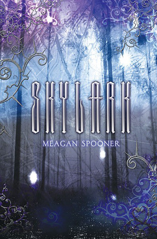
5. The Modern Masterpiece. I love these book covers because the subject matter is very old and fantastical feeling, yet the sharp, metallic silver text gives it just the right amount of modern intrigue.


I totally agree with you on all your points!!
ReplyDeleteOh, and when they slap a scene from the movie adaptation as the cover...oh, don't even get me started. *GRR!*
Ugh, yes! I mean, I like it the other way around--when they adapt the book cover in some way for the movie posters. But you should not change the book to fit the movie that the BOOK inspired. Thanks for commenting!
DeleteLove your reasons, Elle! :D I keep swooning over the UK book covers for Brandon Sanderson's books, particularly Warbreaker and the Mistborn books -- they look like a cross between pencil drawings and watercolour paintings. Gorgeous!
ReplyDelete(P.S. Loving what you've done to Telltale Ink! It looks great!)
Thanks, Skye! I just looked them up--they are gorgeous! I love the UK covers of Daughter of Smoke and Bone, they're lovely too. The American covers are just awful. I wouldn't have even picked the book up if so many people hadn't been recommending it.
Delete